Serif vs. sans-serif—the battle continues. Or does it?
Some writers prefer a comfortable, warm serif. It’s what they know. It’s what they love. It’s nostalgic. And they like that.
Meanwhile, other writers—particularly of the younger generations—say screw that ish! Apple, Google, Reddit—all use sans-serifs. Along with pretty much the whole damn Internet. Need we say more?
So when our tech writer pal, Rachel Marie, sent in this infographic from UbanFonts.com and told a little story to go with it, we had to share.
I am in the middle of explaining to my guy why he shouldn’t use a serif font in his gym logo, and he’s having a really hard time getting his partner to give up the clunky all caps serif name. It’s driving me crazy. I did a quick Google search and found this infographic explaining the difference …
The struggle is real, Rachel Marie. Keep up the good fight!
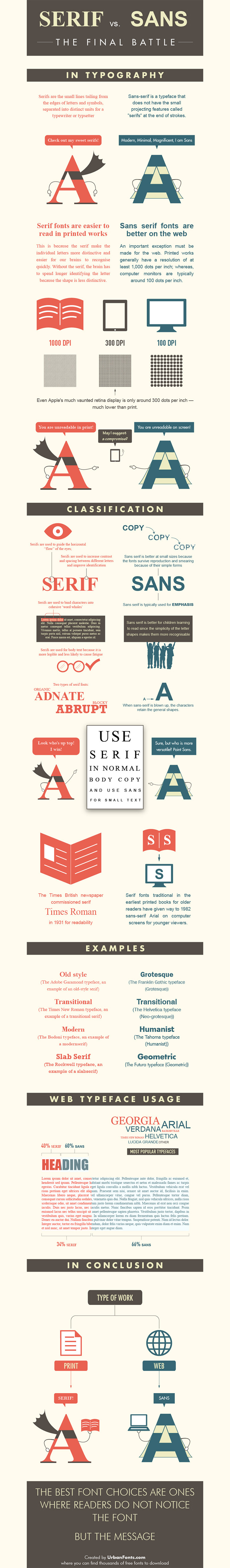
The battle between serif and sans-serif camps seems to crop up less frequently these days as readers have largely abandoned print, where serif is still prominent, for the web, where sans-serif is dominant. But for those of you who still get caught in serif vs. sans-serif showdowns—perhaps when you’re choosing a font for a website or logo—consider putting the choice in context with usage instead of subjective matters of preference.
Discussions on font or typeface usage, like word usage, are only productive when put into context with their purpose and placement. So when choosing a font for your next project—or debating with a friend or colleague about which style is better, a serif typeface font like Arial or a sans-serif typeface font like Times New Roman—consider some of the facts in the graphic below.
And instead of engaging in a debate on preferences, seek to answer questions like:
- Must the font be sized large or small?
- Where will the font be viewed most prominently: print, web, mobile?
- Will the font be used for large blocks of text or short bits like headlines, logos, etc.?
- Should the font evoke emotions relating to long-standing traditionalism or leading-edge modernism?
- What is the demographic of the target audience?
There are no right or wrong answers. Each font usage decision is unique. However, answering these questions—then aligning your answers with the facts below—will help you make a more informed, more definitive choice when the question of font or typeface usage has you or someone else stuck.
Show off your stuff